The best food packaging design solutions for your business

True habit packaging

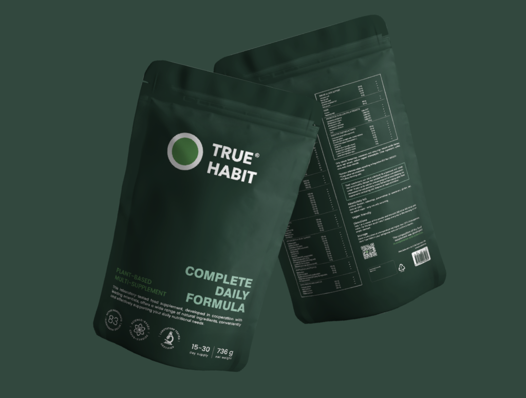
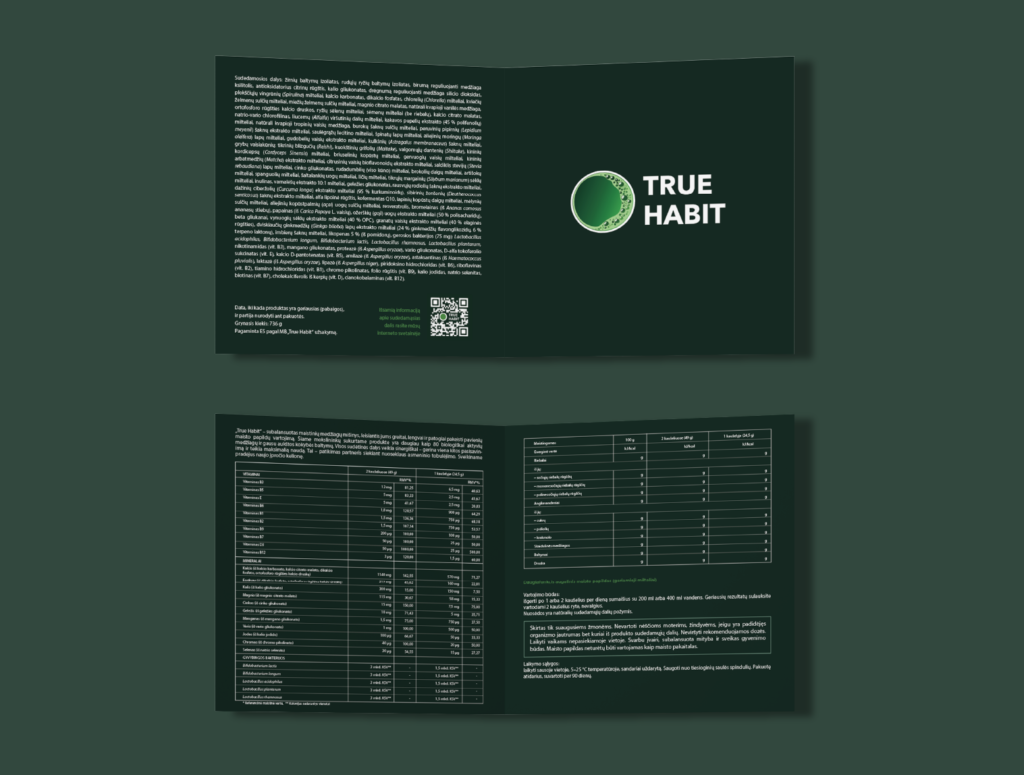
Dietary supplements play an increasingly important role in modern health, offering a convenient way to increase the amount of key nutrients that may be lacking in our diets. In such a competitive market, the importance of packaging and branding cannot be overstated: eye-catching design, clean layout and easy-to-read information instill a sense of trust and credibility among consumers. Health-conscious individuals are more likely to choose products that look professional and transparent.
Two years of research and cooperation with Lithuanian University of Health Sciences (LSMU) scientists allowed Truehabit to create a formula that meets the highest quality standards. Such a great product needed quality packaging. We chose a minimalist design: a rich green background, clearly presented all important information and a broad composition. Such a decision made it possible to maintain a clean design that would appear balanced and reliable to the user.
dark green bags of supplement on a green background
open two sided green booklet design with white logotype and white text
dark green bag of supplement on a green background and fresh veggies and fruits around
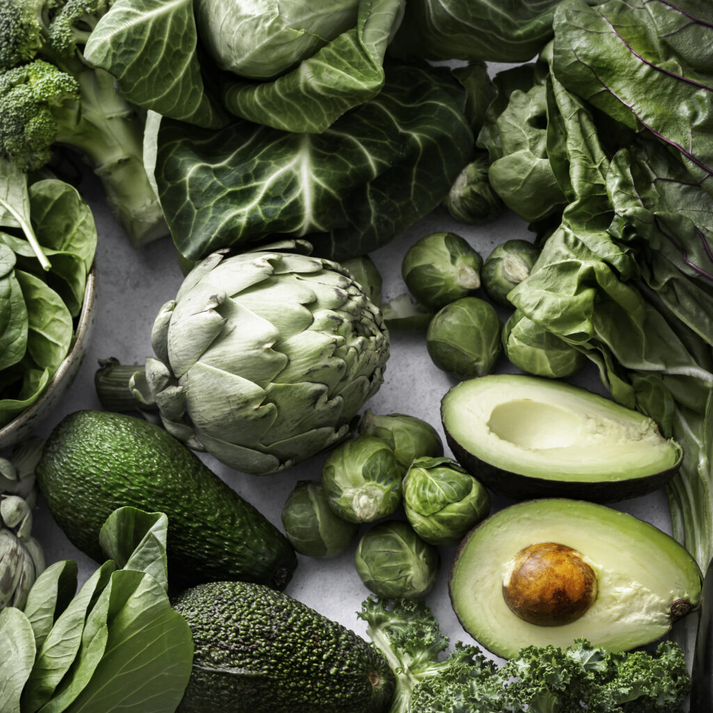
green fresh vegetables, view from above, avocado, broccoli, beetroot, spinach, kale

Honey Crystal brand and packaging development

The brand was born in a beautiful Žuvintas reserve in Lithuanian forest. One of the most important tasks was to highlight the value of natural honey produced in a unique environment, the family’s experience and care for their bees. The starting point was given by the client who wanted to highlight the crystalline structure of honey. We also looked for inspiration in old family photos, landscapes, because the project reflects the passion and craftsmanship of several generations. I looked for ideas by researching plants in the pollen collection season. The characteristics of each type of honey directly depend on the area, its landscapes and flowers.

During the creation of this brand and labels, special attention was paid to the details, as well as to the overall aesthetics, to emphasize the product’s benefits and convey positive emotions to the consumer. The biggest challenge was combining the various symbols: the structure of the honey crystal, the environment of the bee farm, family traditions, specific plants and flowers. It was necessary to find the right balance between all the elements and not spoil the delicate style of the labels. The project consists of 3 large labels (1 kg.) and 3 small ones (500 g.) for spring, summer and autumn honey. Also 9 honey mixes with fruits and spices, pollen and natural wax candles.
honey crystal honey brand logotype design on white background
three honey bottles with label designs, on a white background
two small honey bottles with label designs, on a background beige colour hand drawn plant illustrations
Honey jar with yellow label design with beekeeper illustration on a white background
white picture with plant illustrations in golden colour and below are two bee pollen bags with nice design in yellow and blue color
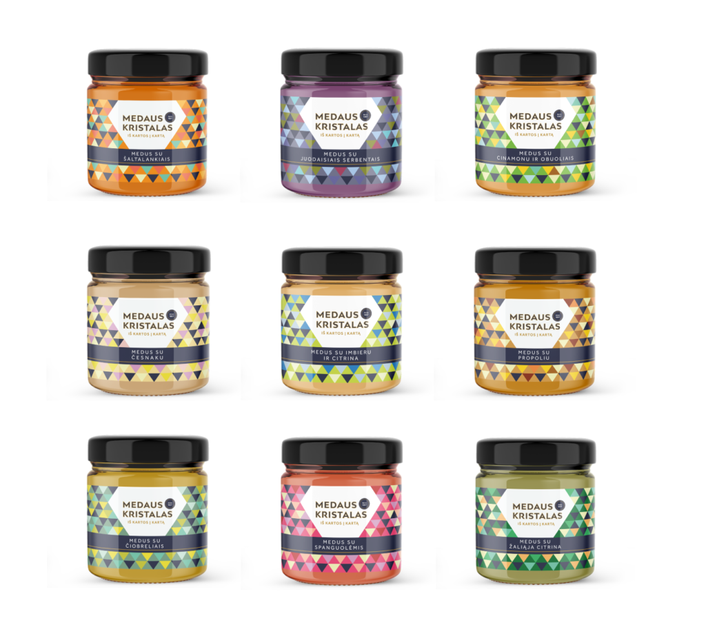
nine small honey jars with colourful labels indicating different taste

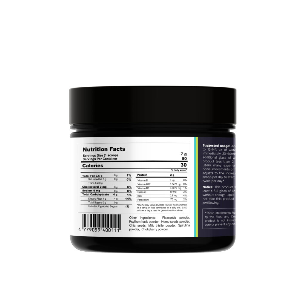
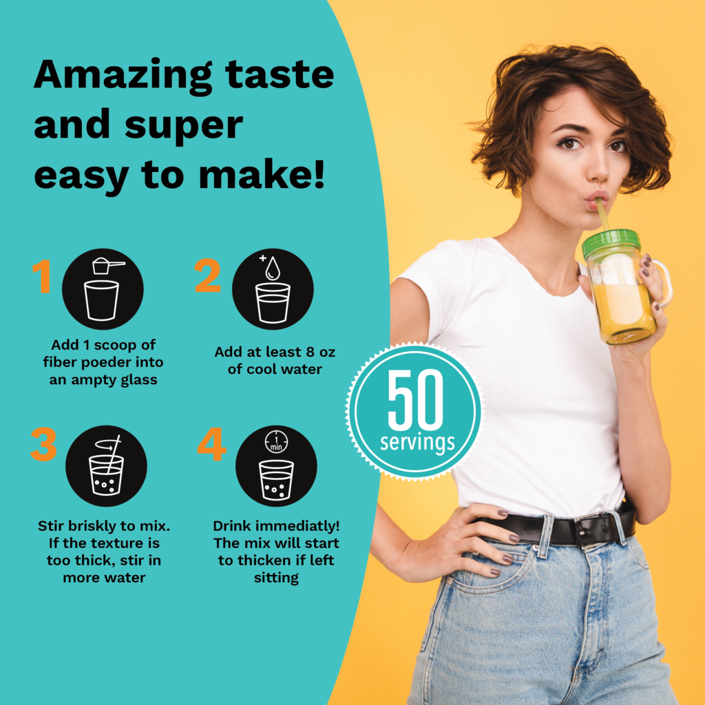
Greendeus supplement labels

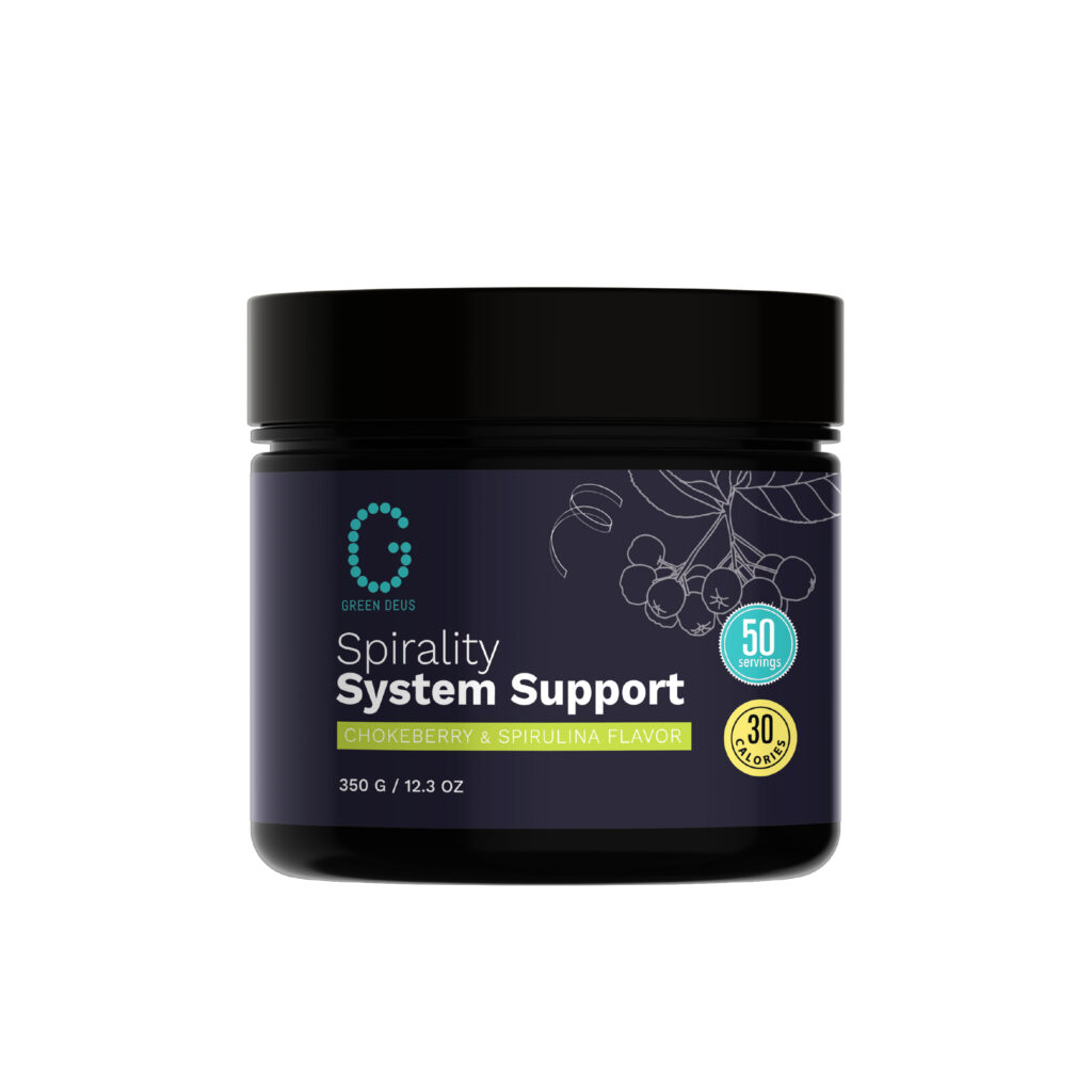
The health supplement market is saturated with choices, so creating a strong product identity is critical. The task of this project was not only to clearly show the advantages of the product, but also to stand out from the competition with a contrasting packaging and clean design. Supplements directly affect human health and user trust is extremely important, so I tried to make the labels clear, not overloaded with information, but at the same time subtly communicate the necessary message to the user.
Greendeus food supplements are three different products designed to support the body’s energy, stimulate intestinal activity and strengthen the immune system. The main goal was to sell on Amazon USA, so already at the design stage there were many restrictions and specific requirements for this platform. Contrasting colors clearly distinguish the purpose of the product. The modular design style will help the brand in the future if new products need to be introduced.
dark purple supplement jar with dark purple label on a white background
happy girl standing with an orange colour drink in her hand, on the side are some infographics how to prepare the drink
nutrition fact design for a supplement brand greendeus

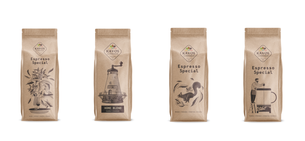
Kavos gurmanai coffee packaging
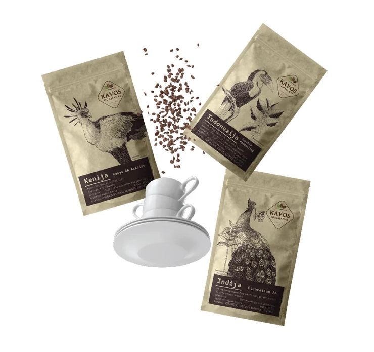
In a market where thousands of coffee brands compete for shelf space, packaging plays a crucial role. It is the first point of contact between the product and the user, so a strong visual impression is essential. Great packaging not only protects the beans, but also reflects the quality, freshness and values ​​of the brand. Eye-catching design, sustainable materials and clear origin information help the coffee brand stand out from the competition. Showing the natural essence and benefits of a product through packaging design is a very non-trivial task that requires a comprehensive approach. It is especially important that the product blends smoothly into the general product line of the manufacturer and at the same time clearly conveys its unique features to the potential user.
The client wanted to develop the existing line of coffee packaging, to create a common concept – monochrome packaging with some animals from nine coffee-growing regions. After some sketching, we decided to use bird illustrations. I looked for inspiration in old biology books, birding guides and botanical magazines. The main challenge was finding the right poses for the birds and a balanced illustration style that was bold yet elegant. It was also important to find the right line thickness for the illustrations so that they would look sharp when printed on the kraft paper bag. The project consists of 15 bags of 250 g each. and 3 bags of 1 kg each.
Silver award winning coffee design packaging with bird illustrations, Kraft doy bags with dark brown illustrations
Award winning coffee bags design, three craft paper bags flying with brown illustrations and white coffee cup
threw coffee bags , espresso special and home blend, in craft colour and black text, cafe interior background
award winning coffee bags design, craft paper with brown illustrations
four coffee bags, craft colour and brown illustrations

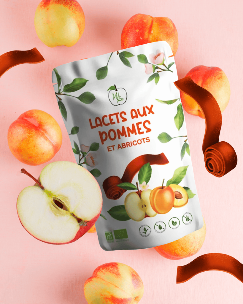
Milu Pomme packaging

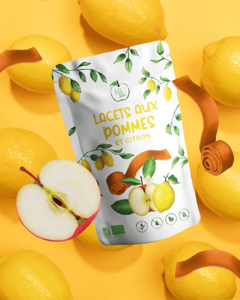
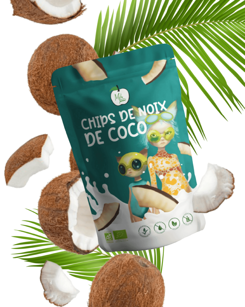
We have updated some of the packaging of the French dried apple products. The idea was to show the freshness and taste of locally produced products. We tried to integrate futuristic characters in the coconut packaging. The main focus was on the composition, colors, so that the packaging would naturally fit into the overall product line.
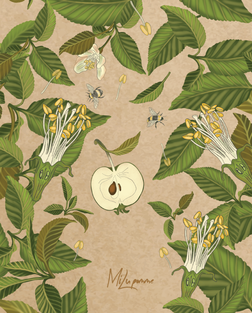
The highlight of this project is the hand-drawn illustrations. Both the realistic illustrations of apricots and lemons and the futuristic illustrations of the characters emphasize the lightness and freshness of the product. Bright colors and a playful font invite customers to try new delicacies. The project consists of 3 packages of 180g each. and 2 gift boxes of different sizes.
Apple and peach Packaging design for Millupomme brand
Apple and lemon Packaging design for Millupomme brand
Coconut Packaging design for Millupomme brand
milu pomme gift box , craft paper and apple illustrations

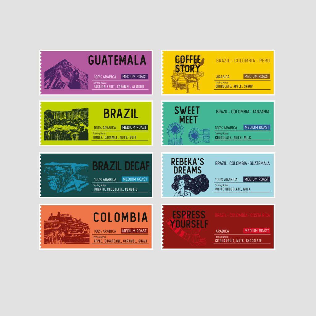
Roasters ministry coffee packaging

The coffee market is expanding, and the ranks of coffee connoisseurs are growing: both experienced “connoisseurs” and those who are completely new to the world of coffee are looking for specialty coffees. Creating a visual design for a completely new brand is always a serious task, which means close cooperation with the client. After all, it is only through intensive communication and exchange of ideas that a clear vision of the brand can be created and its development vector determined.
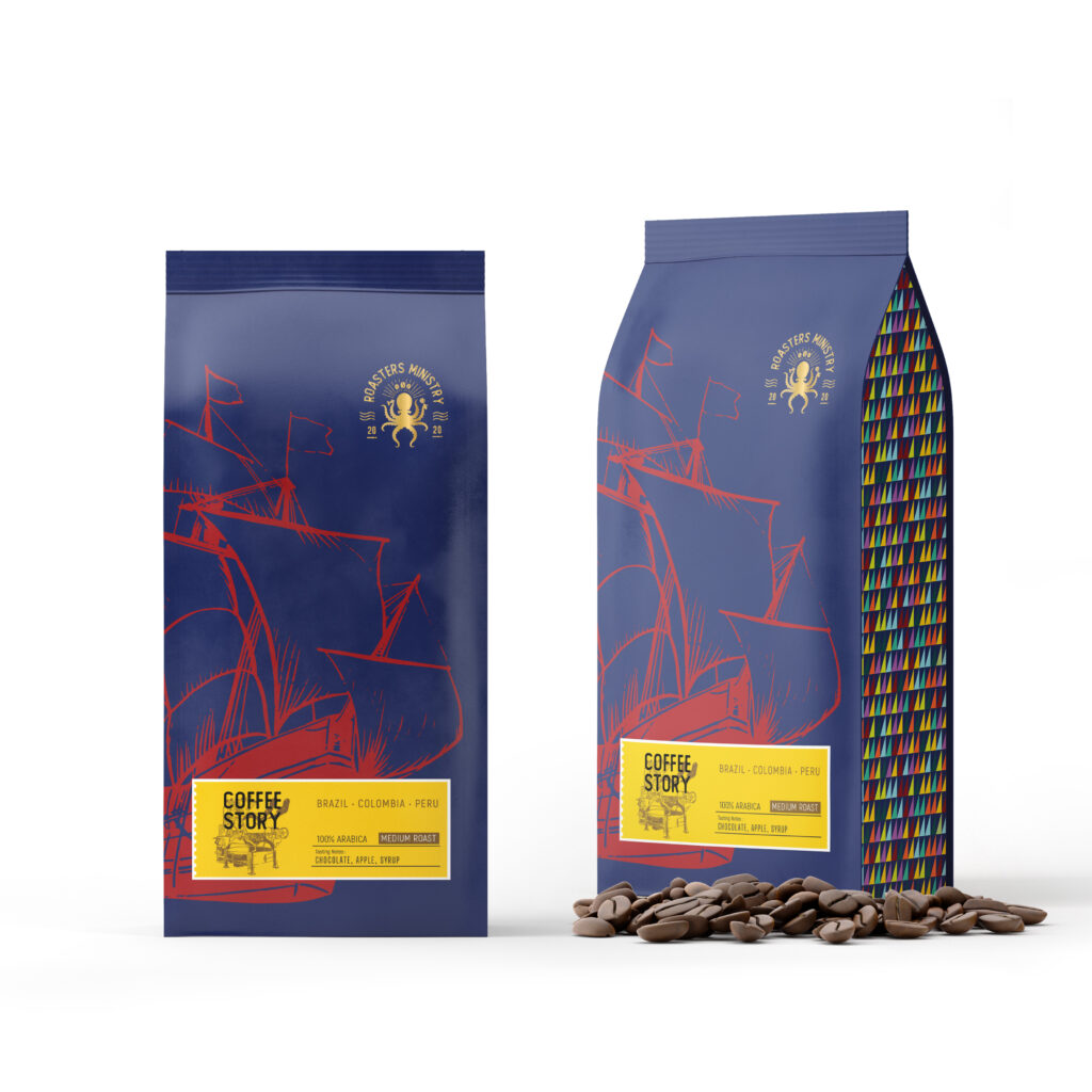
The idea of ​​”Roasters ministry” was born inspired by the spirit of travel: the client wanted something between the aesthetics of the 70s the United States of America and the nautical style. For the logo, we chose an octopus character juggling barista instruments, it is a symbol of multifunctional work. The packaging of each coffee is decorated with an illustration of a ship, and on the label there is another small illustration reflecting the spirit of the country or the coffee blend. On the sides of the packaging – a motif of a colored sail that connects the ideas of travel and coffee.
two bags of coffee in luxury packaging, white color and blue details, clear blue labels with coffee tasting notes
two bags of coffee in luxury packaging, dark blue color and red details, yellow labels with coffee tasting notes
coffee labels in different colours presenting different country
red coffee cup and saucer with a blue coffee brand logo

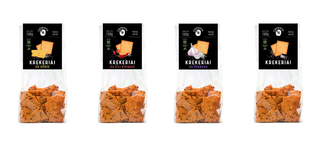
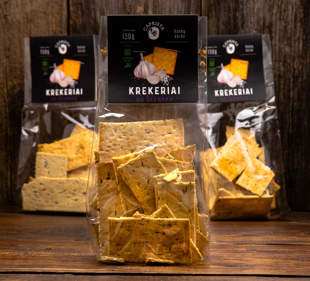
Caprista crackers

Organic crackers made with organic, local ingredients are a healthier choice for both consumers and the environment. Packaging made from recyclable or biodegradable materials reflects the brand’s commitment to sustainability, making it easier for customers to trust the product. In short, combining great product with sustainable packaging and authentic branding creates a winning formula for thriving in today’s organic market.
We have created 4 labels for a new line of organic crackers. The starting point is “fusion” food photos, but instead of photos we decided to make digital illustrations. Organic products are often considered to be of the highest quality, so packaging should reflect this. Matte finish, dark background gives a premium impression and shows quality. The challenge was to find the best way to represent the ingredients: the illustrations had to be quite realistic and at the same time have a handmade aspect.
four bags of crackers with black labels and a hand drawn illustrations
three cracker bags standing on a table, black labels
two cracker label designs in black color and handmade illustrations, white text

Aukštaitijos bravorai craft beer labels
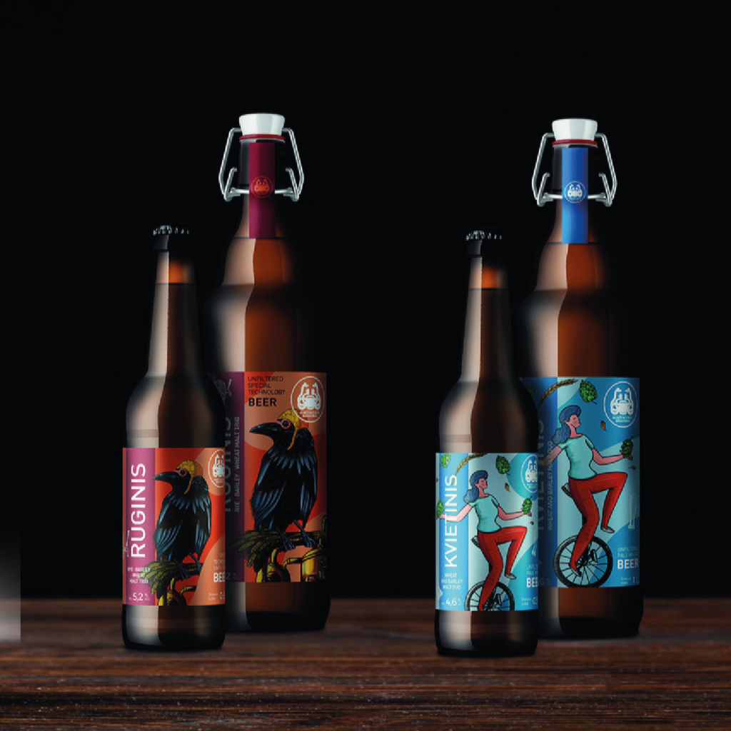
The brewing industry is very unique and dynamic. There are constant experiments, collaborations, unique and individual batches of beer, improvements to existing products. Highland brewers applied to renew several beer labels. Rye and wheat were supposed to reflect the flavor notes of the drink, while Kraft was a bit different – in a cubist style, emphasizing the unique and experimental character of the product.
In my works, I often use illustrations and beer labels are a very appropriate space for that. Rye beer label in rich colours, detailed raven illustration reflects the “earthly” character of the drink. Wheat beer is light and refreshing in summer. The illustration of a girl juggling hops and wheat adds playfulness. Clear typography, highly visible logo attracts attention, creates a direct connection with users.
10 Innovative Beer Bottle Food Packaging Design Ideas for 2025
three craft wine bottles in dark brown colour and brown, black labels with head illustrations
craft beer label design, man making beer with brewery equipment in cubistic style
two colourful beer labels, craft and rye beer, human head and a crow illustrations, orange, black, blue colours

"Geri metai" wine labels

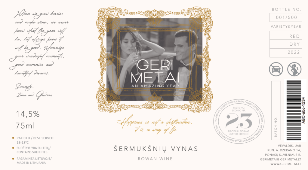
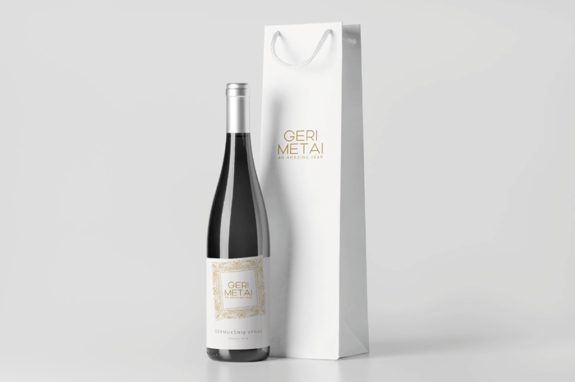
I Have created a logo and labels for a rowan wine producer from Lithuania. The idea behind the title Good Years was that every year would be the best. The authenticity of this product line is its origin. Production is small and each bottle can be personalized to add more value to the customer. The challenge was to find a creative way to represent family values ​​and craft spirit through this project.
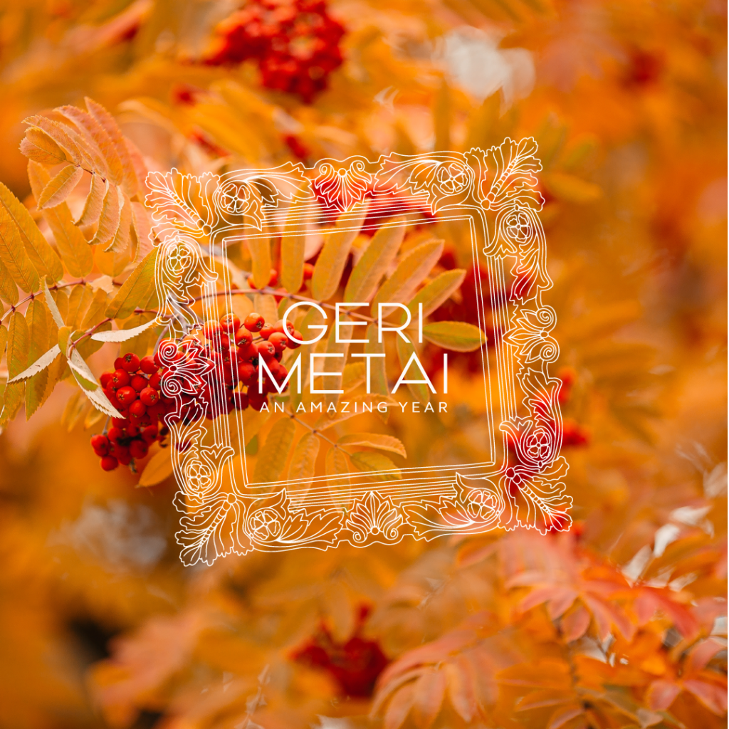
The client wanted an elegant, light and minimalist style. For the main accent, we chose a picture frame, which seems to take us back to the memories of the last Good Year. The unassuming logo font and handwritten wish add to the nostalgic mood. Basically, all graphic elements emphasize the lightness and dynamism of the product. The stamp with the batch number confirms the authenticity of the drink.
mark view of hands holding a wine bottle elegant wine label
two elegant wine labels with a black and white photo of a couple and golden and grey details and texts
rowan wine label, golden and grey details on a white background
elegant beet bottle with golden color label design and a white bag standing together
elegant rowan wine logo design on a rowan picture, orange colours

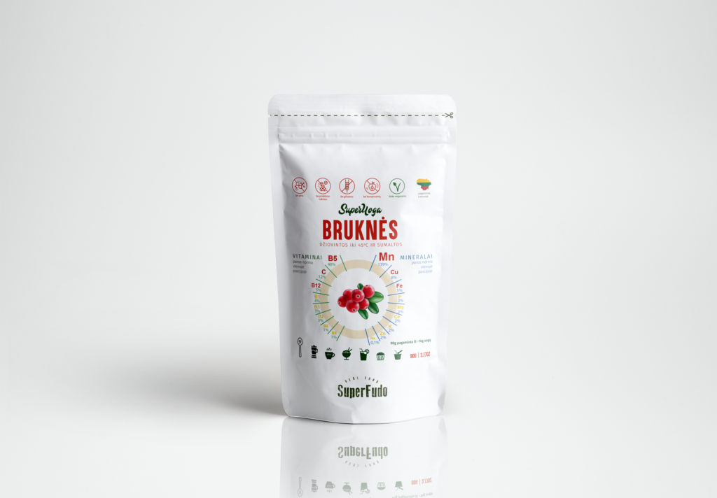
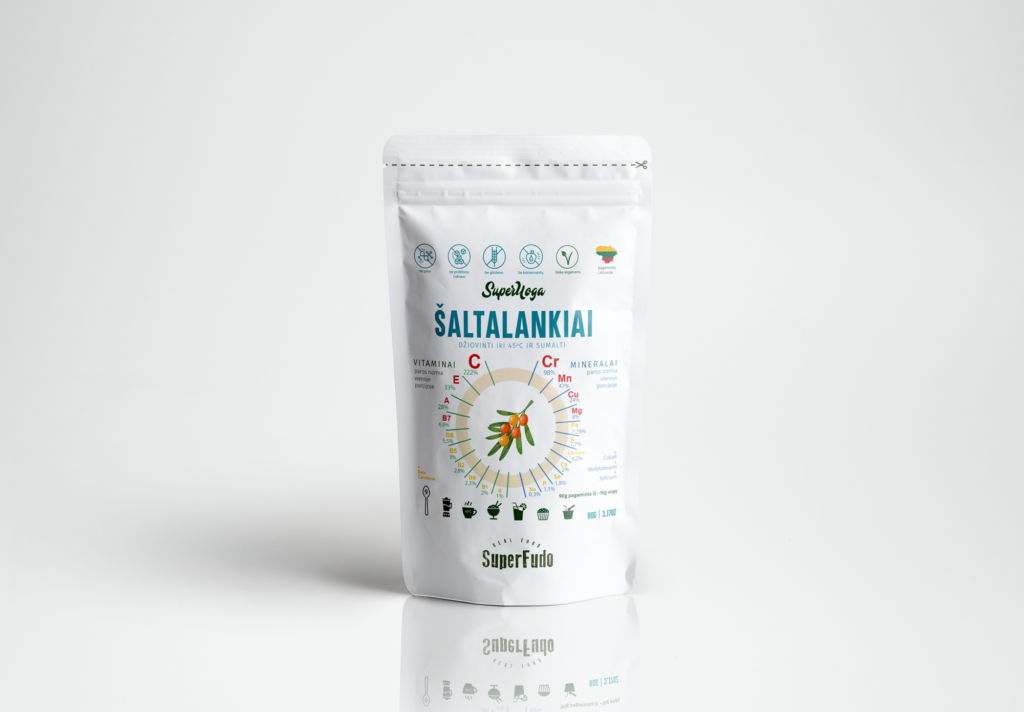
SuperFudo packaging

Organic natural berry powder has become very popular as a convenient way to enjoy the nutrient-rich benefits of berries year-round. Although organic natural berry powder has many health benefits, its success depends heavily on thoughtful packaging and branding. Packaging preserves the integrity of the product, while strong branding conveys the values ​​and credibility sought by today’s health-conscious consumers.
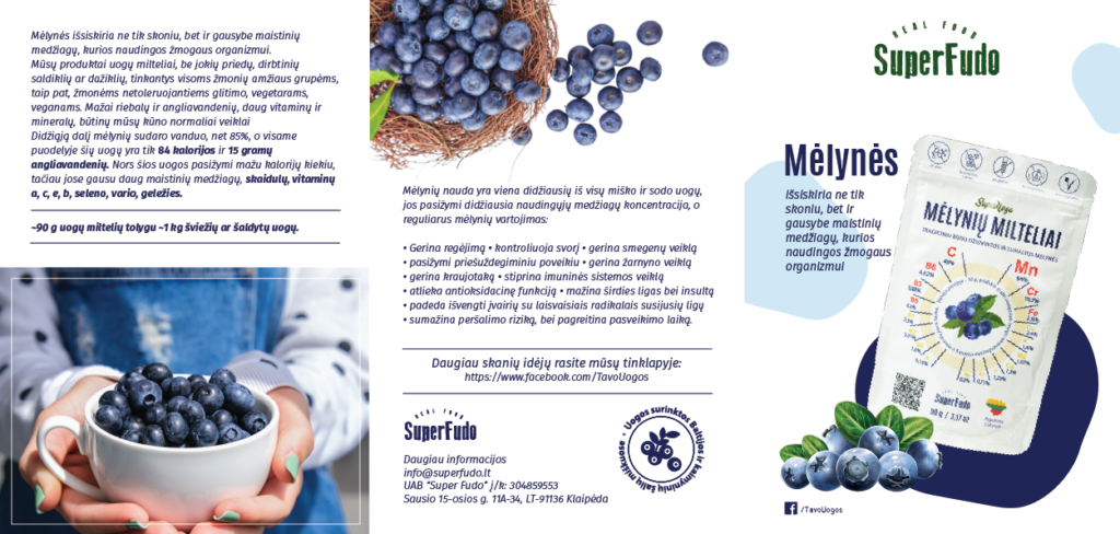
We have reated the “SuperFudo” logo and packaging for dried berries from Lithuania. By using traditional methods and combining them with new technologies, they have found ways to bring you only health-enhancing and naturally healing products. SuperFudo collects fruits, berries and herbs in a natural and traditional way. Therefore, the product also needed a fresh, natural image and at the same time focus on the health value.
dried sea buckthorn bag design with sea buckthorn branches and a badge on a white background
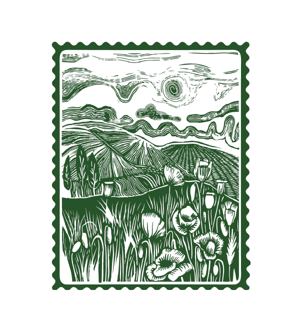
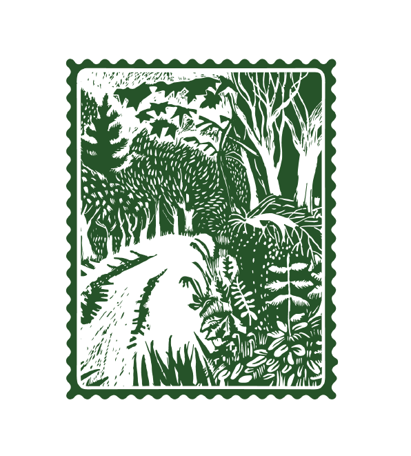
hand drawn post stamp of a field in green color
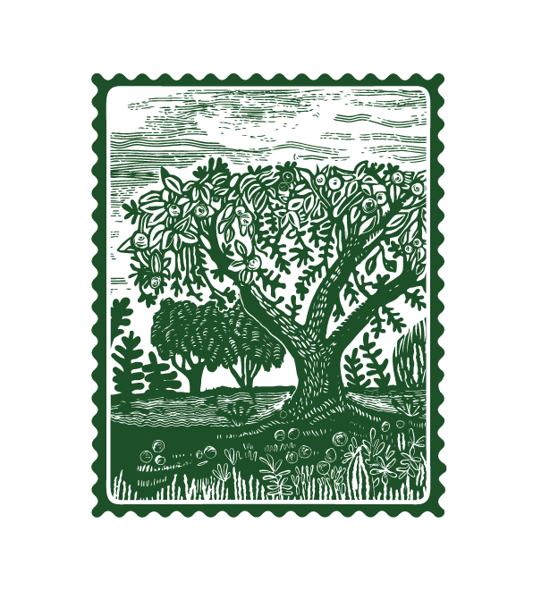
hand drawn post stamp of a garden in green color
hand drawn post stamp of a forest in green color
dried berries brand booklet design presenting blueberries
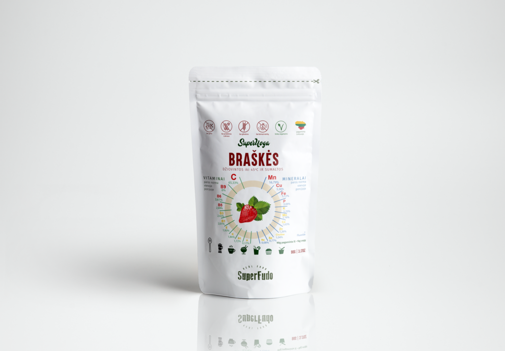
dried strawberry packaging in a white doy bag on white background
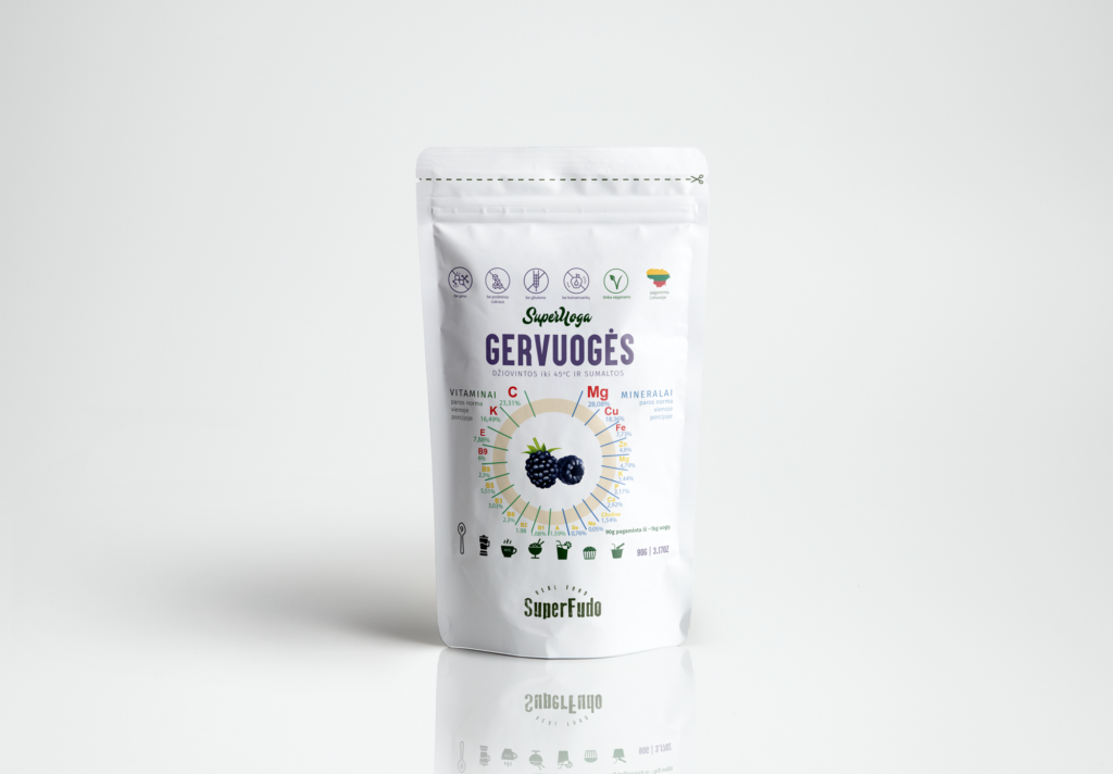
dried blackberry packaging in a white doy bag on white background
dried cowberry packaging in a white doy bag on white background
dried black currant packaging in a white doy bag on white background
dried sea-buckthorn packaging in a white doy bag on white background
dried cranberries packaging in a white doy bag on white background

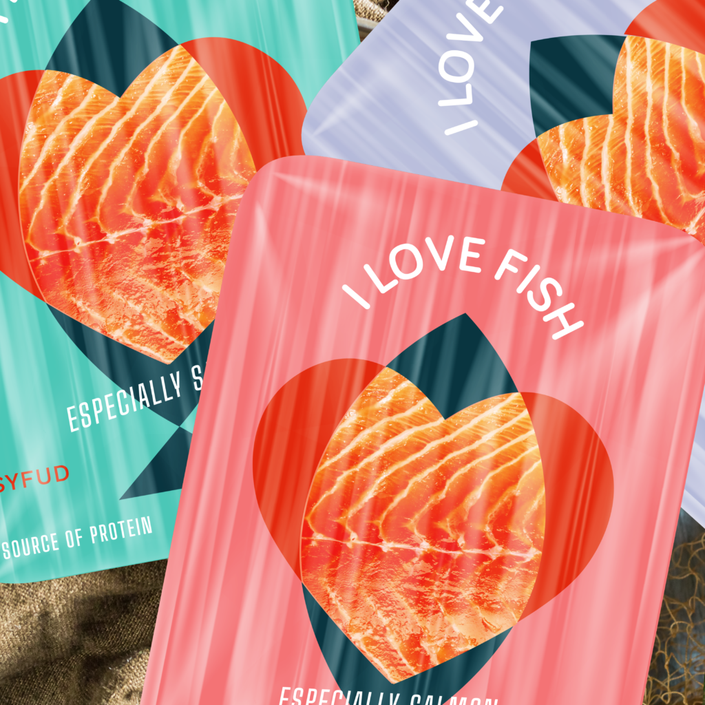
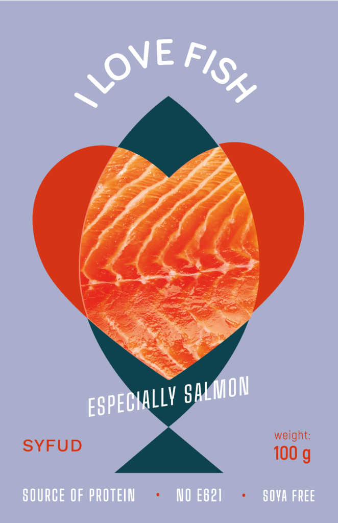
Syfud packaging

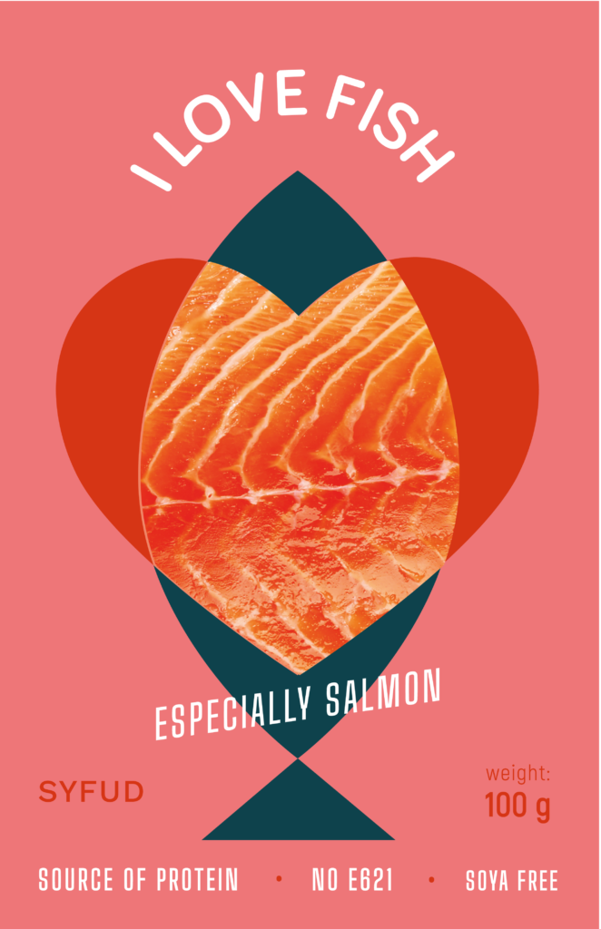
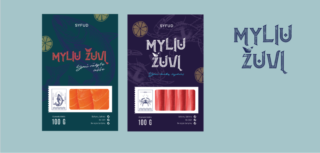
A producer of salmon and surimi sticks in Latvia wanted packaging for their products. The client wanted an elegant and clean style. The products are from the Baltic Sea and intended for the Baltic market. When thinking about the packaging, we had to consider the taste of the local customer. The challenge was to find an image that would convey the value of the product and at the same time stand out from the competition in terms of graphic style.
At the sketching stage, we tried various options: from playful to subtle, but we settled on a laconic packaging option, because the product slogan “I love fish” appeals directly to the consumer. I proposed a packaging option that combines heart and fish shapes. We chose the colors so that we could emphasize the freshness of the fish products.
Design and Packaging for salmon, pink and teal color
salmon packaging example, blue fish and red heart on a khaki background
salmon packaging example, blue fish and red heart on a purple background
salmon packaging example, blue fish and red heart on a pink background
syfud fish packaging design examples and logotype version on a blue background

Acappella packaging

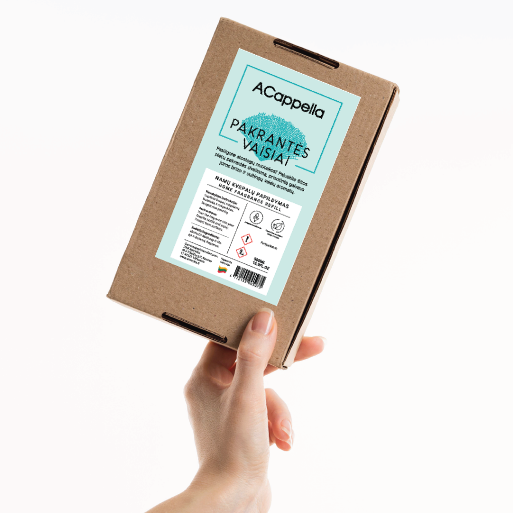
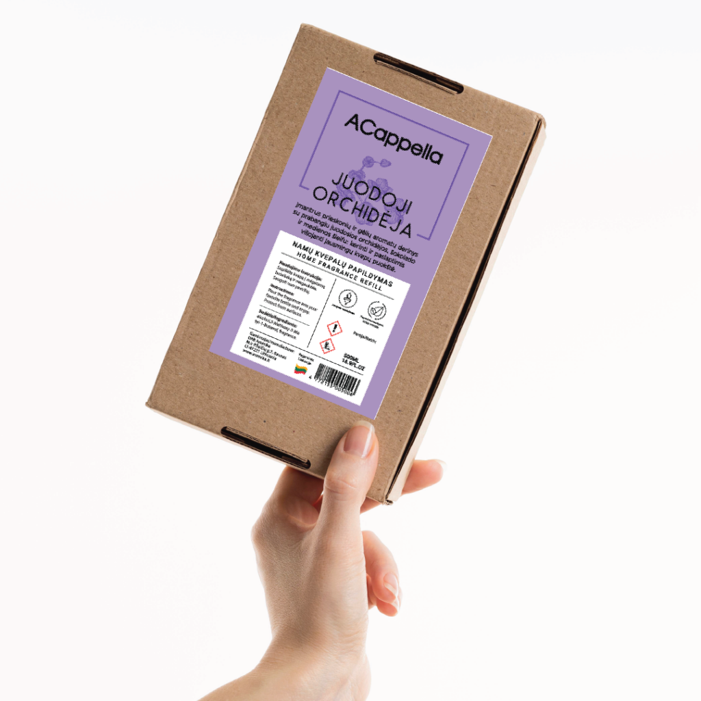
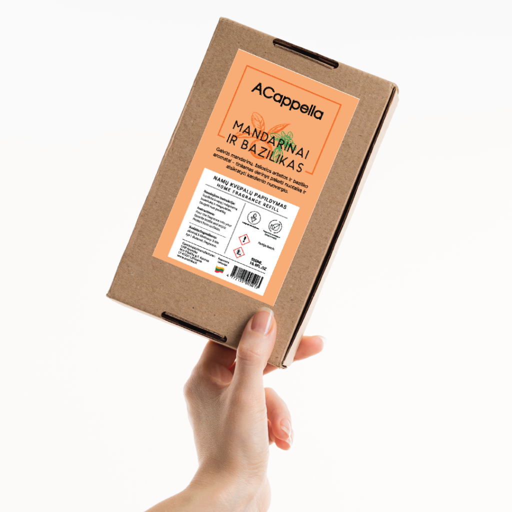
The label is an important part of the story of your home fragrance brand. By carefully combining the right design elements, you can create beautiful, professional labels. The client wanted a fairly decorative style, while it was necessary to convey the characteristics of different scents, and it was possible to do this with the help of both illustration and colors. 
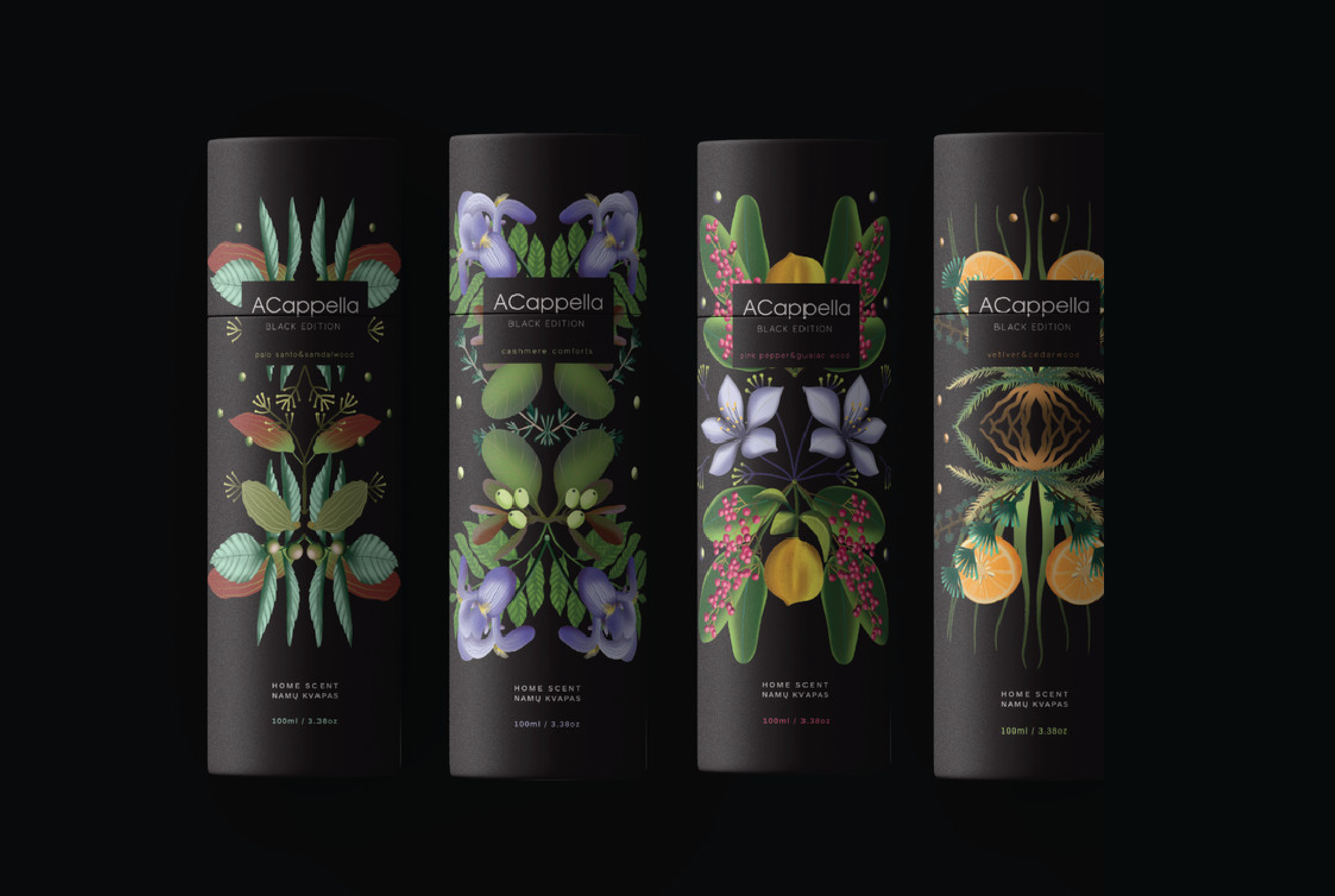
The packaging of the Black edition line is more luxurious, the stylized illustrations of plants in them reflect the notes of home fragrances. The mirror reflection graphically enhances the impression, repeating the scents given by nature. A dark background makes the illustrations stand out better and gives the packaging a distinctive look.
home scent packaging, round paper tubes , black edition, plant illustrations on a black background
hand holding a craft bow with home scent labels, teal color, white background
hand holding a craft bow with home scent labels, pink color, white background
hand holding a craft bow with home scent labels, purple color, white background
hand holding a craft bow with home scent labels, yellow color, white background
hand holding a craft bow with home scent labels, red color, white background
hand holding a craft bow with home scent labels, orange color, white background

Alaus režisieriai beer brand and label
For a young beer brand, the label is one of the strongest marketing tools. By combining creativity with clarity and authenticity, your label can help your beer stand out in a competitive marketplace and build lasting relationships with customers.
“Alaus rezizieriai” is a youthful beer brand. We wanted this to be reflected in the entire graphic style of the brand. Bright yellow and black balance between tradition and youthful edginess. The labels of the popular beer Pale Ale invite you to drink your favorite drink like a movie ticket.
beer directors brewery logotype, black on white background
Beer directors beer brand design, logotype on the front of a yellow cap.
beer directors beer bottle design, bright yellow label, decorative stars

Jonė bread packaging refresh
My client is one of the few bakeries in the country that resisted the temptation to “modernize” the long-lasting traditional process of baking bread in the name of quick economic benefits. Therefore, bread baked according to recipes and technologies perfected by the ancients for centuries is really healthy and useful for the human body.
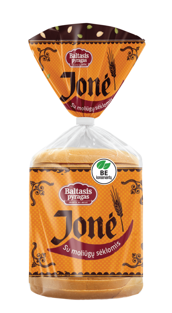
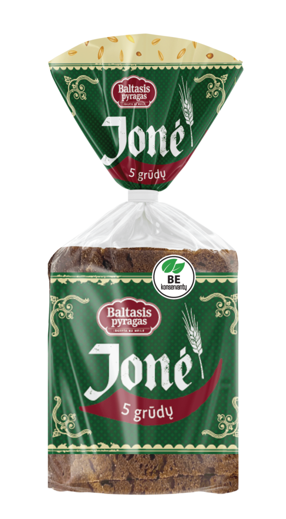
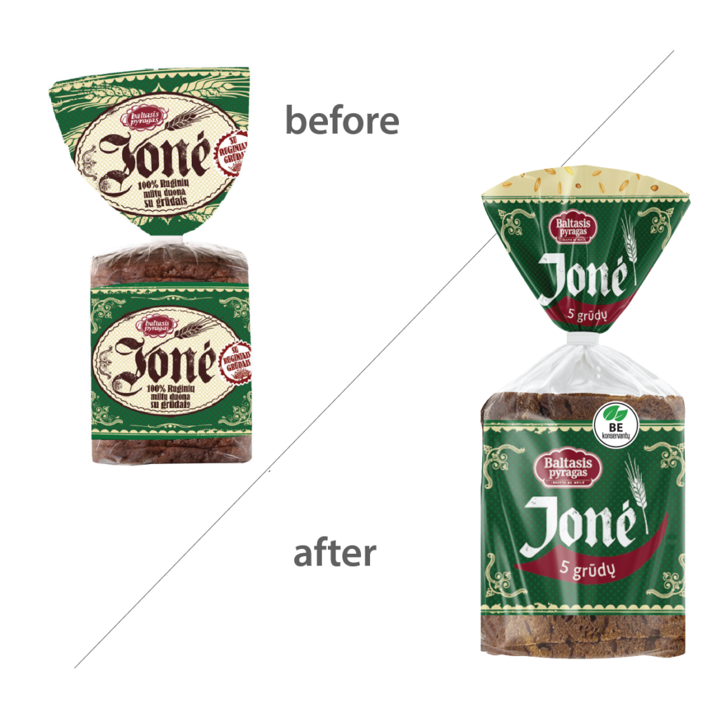
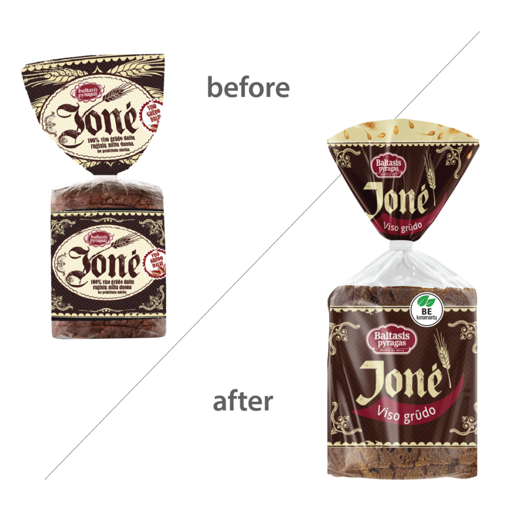
One of the most loved breads – “Jonė” bread – needed a packaging update. In the course of the process, the logo changed, we adjusted the colors, but we did not stray too far from the previous version, so that the user recognizes the product he likes. The result was lighter, but did not lose its identity.
bread packaging design in orange color
bread packaging design in green color
bread packaging design in brown color
before and after picture of bread packaging refresh, transparent sliced bread with pumpkin seeds, orange label
before and after picture of bread packaging refresh, transparent sliced rye bread bag green label
before and after picture of bread packaging refresh, transparent sliced rye bread bag brown label